Devlog 1 - Player Movement
In this devlog I'll talk about the initial progress made with the project, the player movement, and player animations.
Starting out, Let's talk about movement in Boss Rush Hour, or BRH for short.
Movement will be a core facet of BRH, as the player will be constantly moving around to avoid enemy attacks. Having consistent, responsive, and quick movement will be necessary to keep the player in control of dodging attacks. The player's default movement speed will be quite fast as I want the game to feel fast-paced.
I also plan to add a "dodge" mechanic, where the play can move very fast in a direction to quickly avoid attacks. I will mess around with adding an "I-frame" mechanic which essentially allows the character to briefly not be able to take damage while dodging, allowing players with good reflexes to dodge attacks and get themselves into advantageous positions.
Movement
To start off with I wrote a simple script that detected the player input using Unity’s inbuilt Input manager, essentially allowing for a simple, intuitive way for multiple inputs to be used and configured. In this case, it allowed me to use WASD, Arrow Keys, and a Controller’s thumb sticks to control the player.
The first attempt took very little effort to produce something workable, but I couldn’t help but feel something was already “Off”.
I noticed how smooth it felt, obviously, somehow it was lerping (moving smoothly between two points) without me programming it in. Initially, I was very confused but after some googling, I found out it's due to Unity’s Input system automatically lerping.
After replacing it with another function that didn’t lerp it came out much more responsive, exactly how I wanted. Although eventually, I didn’t want to implement my own lerp but one that was much more responsive. Feedback from other's commented that movement felt good, although there was a slight issue with diagonal movement seeming slight faster than horizontal or vertical. One person suggested normalisation more inputs and that immediately fixed the problem.
Collisions
Implementing Collisions was easy enough. Having a Rigidbody on my player object allows it to collide with other objects. I use a 2D box collider as the final collider will only be a small square around the player's feet. It'll make more sense later when I am implementing the environment and enemy attacks.
As per usual for top-down view games, I set gravity to 0 and froze Z rotation. This stops it from automatically moving downwards and stops it from rotating when hitting objects.
Player Sprite and Animations
At this point, I had been working on my player sprites and had come up with something that looks nice enough. I don’t have amazing artistic skills, so I stick to simple pixel art typically, especially for anything animated.
I imported the sprite and started working on getting the animations working. It’s quite easy to underestimate how long it takes to get the animation system working, especially with branching animation paths. It ended up taking a bit longer than I expected but I ended up getting a nice result.
The Character sprite I made only faced one direction, so I had to write code to change the x scale of the player to -1 whenever they faced in the other direction.
After this, I tried to implement the shooting animation but that’s when I noticed a small but annoying detail. If you were running left but shooting to the right you’re character’s arm still faced to the left.
The Solution I came to was to separate the upper body and legs into two objects that were children of the main player object, both the body and legs were animated by the main player object. This allowed me to individually change the side that both the top and bottom halves face.
While others were messing around with my game they noticed that occasionally the player's arm wouldn't switch back to the right side correctly, I checked the problem and it was because the "shooting" animation couldn't be interrupted, fixing this resulted in a nice looking animation.

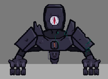
In my initial concept documents, I showed a darker environment that I wanted to emulate in my game but initial mock-ups for the first boss didn't really have that run-down gloomy feel that I would like. In turn, I drew up a few more rough designs and eventually settled on a darker, creepier design. He currently sits at the top of the arena that the player is in. I plan to add more parts such as a torso and perhaps betters arms/hands
Projectiles
At this point, I wanted to add projectiles to shoot the enemy with. I left drawing the sprite for later and just added the implementation. The projectile gets initiated on either side of the character, depending on what direction their upper body is facing, shooting out from the player's hand toward the mouse cursor calculated using a bit of vector maths. They have a maximum lifetime until they destroy themselves, meaning no matter where they end up going they will eventually get destroyed.
Enemy Health
At this point, I was getting a bit carried away. I decided that considering I had added projectiles and an enemy, I might as well add the ability to hit the enemy with projectiles!
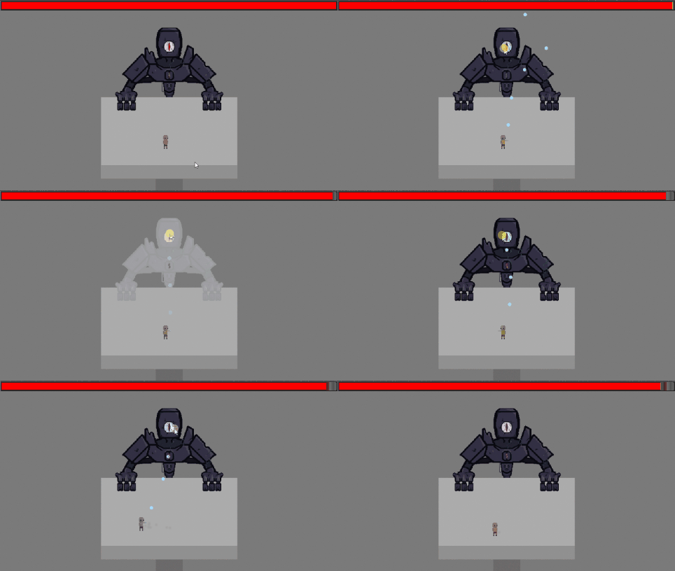
I implemented a basic system for the projectile to collider with enemies, working with Unity's collision layer matrix, and a bit of code and tada - I can now shoot the enemy. I added a health bar at the top to show how much health the boss has as well as added a flashing effect to the enemy on hit which I used a shader from a user called GnomenXD on Unity's forum's (https://answers.unity.com/questions/1074261/make-a-sprite-blink-white-when-hit.h...)
I decided that the boss should have a weak point - Its eye. Only shooting this point deals damage. While I think most players would intuitively recognize this after some trial and error, I think I may try to implement a tutorial of some sort into the game to explain this mechanic
Title Screen
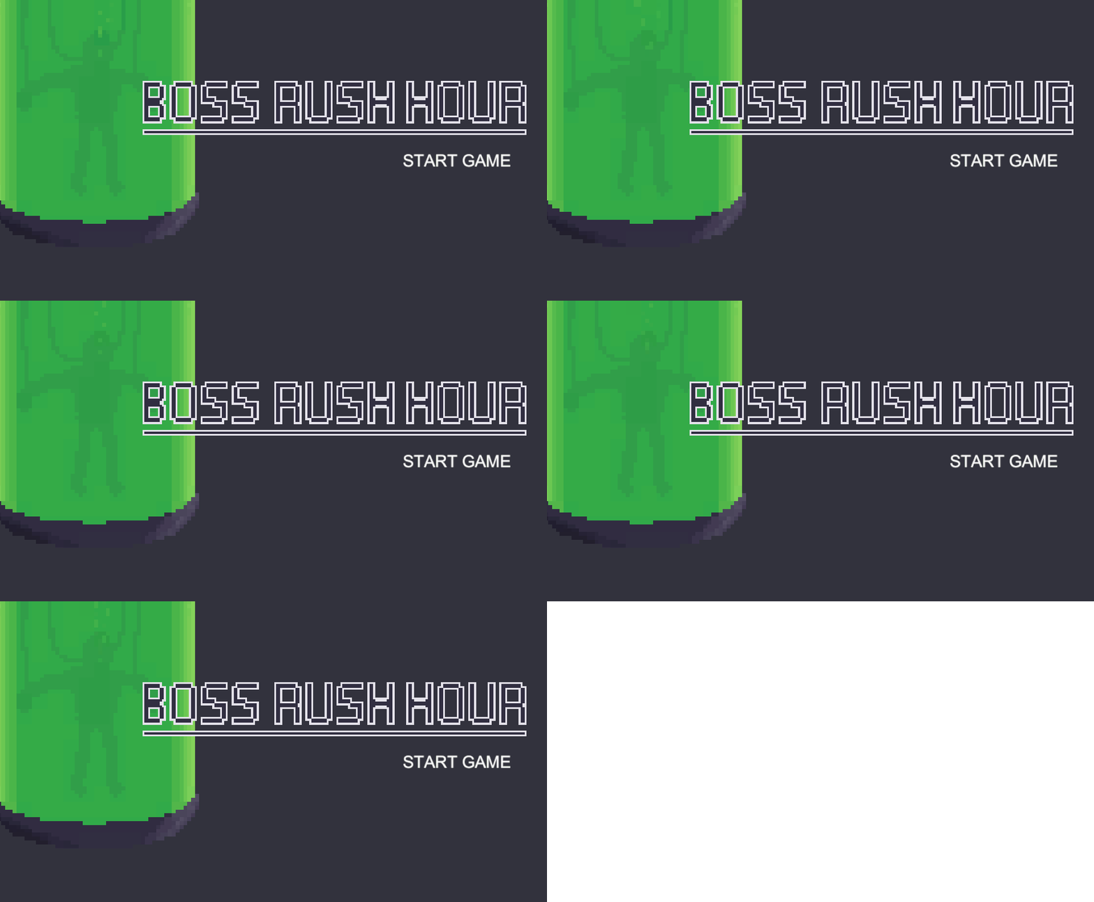
I decided to quickly add a title screen along with a fade animation. I had some difficulties with the buttons working as I was using an image for a fade-out effect which I did not realize, blocked raycasts to the buttons on the screen. The Tank on the left side has a subtle animation just to give the title a bit more life, I plan to add a bit more to it later.
Sneak Peak
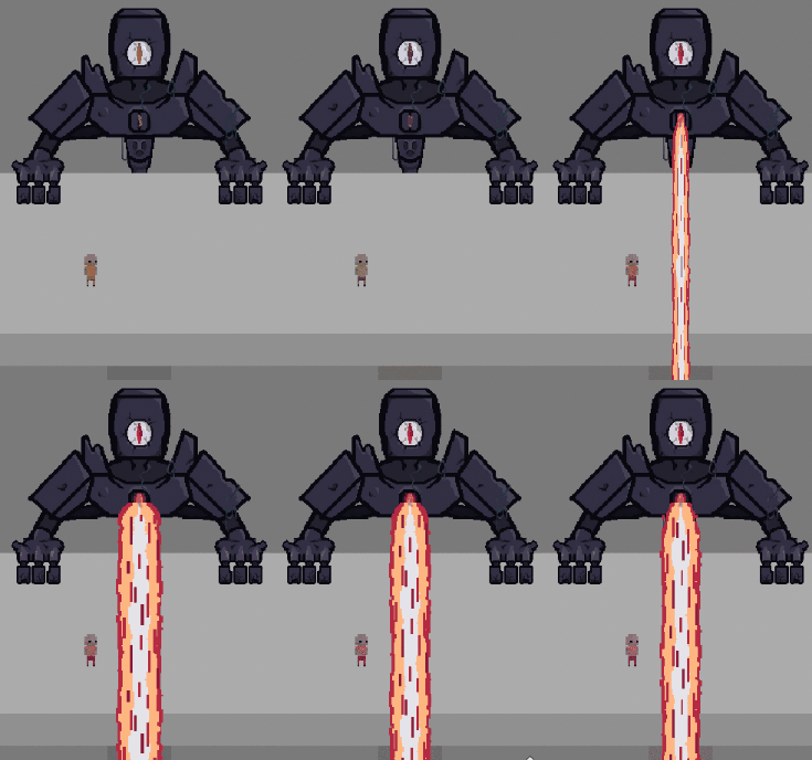
Next, I plan to add enemy attacks and player health, here's a sneak peak!
Boss Rush Hour
| Status | In development |
| Author | Gonburden |
| Genre | Action |
| Tags | Boss battle, Short |
More posts
- Documentation + User GuideMay 26, 2023
- Devlog 5 - PolishMay 21, 2023
- Devlog 4 - Presentation/GraphicsMay 17, 2023
- Devlog 3 - Enemies/InteractionsMay 07, 2023
- Devlog 2 - Basic Level BoxingApr 30, 2023
- Boss Rush Hour - Game Concept.Apr 14, 2023

Leave a comment
Log in with itch.io to leave a comment.