Devlog 5 - Polish

Originally (for a University Assignment) this devlog was supposed to be about UI and Polish but I had already talked about UI in the last devlog so I'll mostly focus on Polish with just a quick mention of something UI related.
UI
In a quick note about the previous devlog, I ended up fixing the bosses health bar and it now reduces in size without "squishing" the texture. Initially I tried to use the Image component's fillAmount which would have worked if the image wasn't tiled. Due to the healthbar using a Rect Transform I was able to adjust it's offsetMax (how much it offsets the edge of what it is scaling from.) which allowed me to reduce the length of the healthbar without "squishing" the sprite.

Polish
Coming up to the end of this week I have decided to stop adding content to the game, at this point forward it shall polish up what is already there. While most of the game works perfectly fine without any bugs (that I have found.) There is still a few areas that need to be finished up.
I'll talk about a few things I plan to polish up first and then the few things I have polished up over the last week afterwards.
Needs Polishing:
Missile explosions
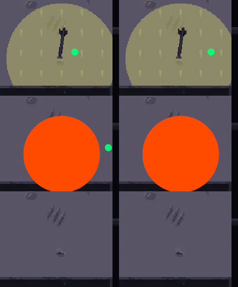
The first thing I plan to do is fix up the explosion animation for the missiles that land on the platform the player fights on. These missiles have been using extremely basic, placeholder sprites for a while now. Thinking about it now, these explosions may have misinformed players about the actual size of the explosions, as they are much smaller than the telegraphing that appears on the floor before the missile explodes.

I plan to update these with a nicer animation, one that actually looks like an explosion of some sort.
Projectiles
Currently, the projectiles that both the player and the drones use are just the default circle that unity provides. I don't believe the sprite for these needs to be too detailed as the player likely won't be paying all that attention to them.
Tutorial
So far the tutorial is only around 50% done. It describes a few features of the game but it doesn't describe a few important things that player testing has revealed. One such tutorial is about the telegraphing zones as seen in the missile explosions section. While telegraphs are a common mechanic in some action games and most MMOs, they are a foreign mechanic and may need to be explained to those who have not.
UI buttons
When the player starts a new game, they are greeted with two options Dream (tutorial section) and Wake (playing the main game). These are not obvious enough these are buttons, additionally, the buttons pop up with a confirm box. Players have suggested making clicking the pop-ups also do that action.
What I've Polished So Far:
Boss Attacks
I've finally finished adding and polishing up all the attacks that the boss will use during their fight. While the balance is still a little bit off, I plan to tweak it over the next week leading up to this game's due date. The boss has 4 different attacks with slight variations to these attacks depending on the difficulty and phase that the boss is in.
Balancing/Difficulty
I've done a lot of relatively minor adjustments to enemy attacks/movement speed and attack patterns, none of which are worth mentioning alone but all up have helped the game feel a bit more fun, especially for those who enjoy a bit of a challenge. Many enemy attributes change between difficulties but I still plan to add more unique and interesting changes between the difficulties so that playing the next difficulty up can nearly feel like fighting a new boss. Also a few testers have complained that the game focusses too much on just firiing at the boss. This has been a problem since the get go as the boss stays in one place and the only incentive to shoot elsewhere has been when the player is overwhelmed by drones.
VFX
I've added a few particle effects and visual effects to attacks that previously lacked them. I am concerned about adding too many and hurting performance or harming the visual clarity.
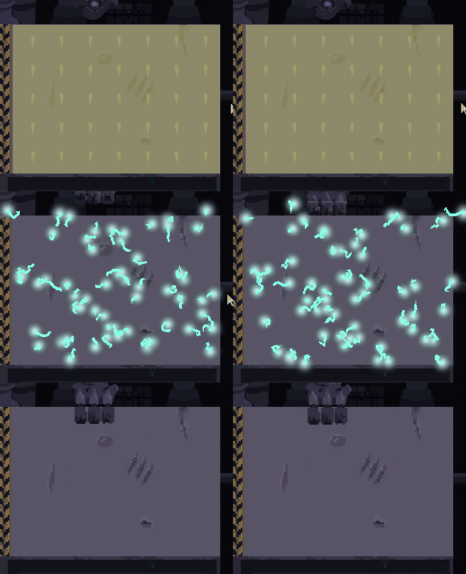
One of the major additions was giving the "hand blast" attacks a visual element. it now fires out electrical looking particles into the area that it hits.

Tutorial
I briefly mentioned the tutorial in the things I plan to polish but tutorials have yet to even be mentioned in any previous devlog. That's because I only started making it this week.
In the tutorials, I will let the player attempt to do a variety of tasks in which they can learn to play the game. These tasks are done linearly and require the previous task to be completed before the next one can be done.
Firstly I taught them how to move around, providing visual instructions on what buttons to press. They will need to press W, A, S, D and do to complete the step and show that they understand movement (hopefully). I am thinking of adding a small maze to help with player understanding. While movement is an incredibly simple game mechanic for most people who play games to understand, you never know who is going to play your game.
They then will be given instructions on how to shoot projectiles, showing a graphic of a mouse with the left mouse button being held down, it seems that the holding down part isn't obvious as many players have been clicking left-click to fire and then complaining about finger tiredness after firing for a long time.
Lastly, the game VERY briefly explains how the telegraphs work, but it is a very simple task to accidentally do and as such I saw many players accidentally do it without getting to understand the mechanic.
After that, the game lists a few more things that the player should know but it is a jarring change of tutorial types and quite frankly doesn't cut it for the quality I want to make.
Additionally, the tutorial area is quite ugly, just being a dark void with the player, a text box, and the tutorial elements the player is interacting with.
Laser Beam Attack
Its finally in the game! it has been teased since the first devlog but I haven't been able to find a good time to create it and full flesh out how it works. but with a better understanding of Unity and my own project I have succefully created what I think is one of the cooler attacks that the boss has, I plan to spice it up a small bit more as it is currently somewhat underwhelming compared to what I had originally wanted. I am thinking of adding screen shake or perhaps a spray of particle effects.

The attack only harms the player when it is at full burst, which I am hoping that players pick up on.
The gif above shows how the boss's hand attack can work with the beam to put the player in dangerous scenarios. I do feel some concern for these sorts of intermixing mechanics as players may think it is "unfair" if they don't understand they can destroy one of the hands to disable its attack temporarily.
Boss Rush Hour
| Status | In development |
| Author | Gonburden |
| Genre | Action |
| Tags | Boss battle, Short |
More posts
- Documentation + User GuideMay 26, 2023
- Devlog 4 - Presentation/GraphicsMay 17, 2023
- Devlog 3 - Enemies/InteractionsMay 07, 2023
- Devlog 2 - Basic Level BoxingApr 30, 2023
- Devlog 1 - Player MovementApr 21, 2023
- Boss Rush Hour - Game Concept.Apr 14, 2023
Leave a comment
Log in with itch.io to leave a comment.