Devlog 4 - Presentation/Graphics
UI
When playing games I've never entirely been a massive fan of most UI's. Most games handle them very poorly by covering a lot of screen space, looking bland, and often breaking immersion. A lot of games use their UI to show things such as health bars, minimaps, active abilities, quest logs, and other things the game needs to inform the player about.
Boss Rush Hour lacks many of these sorts of mechanics that need to be told to the player. Aside from player/boss health, there is no information I wish to convey to the player. I was considering adding a dodge mechanic (A quick boost in movement in the direction the player is moving, possibly making them invincible during the time.) and a sort of ammunition for the player's projectiles so they can't continuously fire. However, these actions complicate a game that really doesn't need that sort of complication.
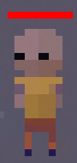
The player's health bar is just a small red bar over the player sprite's head. Its size is defined by a simple calculation:
While it may look a little messy/confusing all it is doing dividing the player's current health (cHealthF) by the max health (mHealthF) (dividing the current value of something by its maximum value gets you back a percentage as a decimal number) and then making sure the value is never below 0 using Mathf.Max() (this makes it so the Health bar doesn't have a negative value making reappear but flipped) then we make this into a Vector2 which we assign to the local size of the Health bar object.
This is only run when the player is damaged via a damage function, meaning that any changes to player health directly applied to the player doesn't cause the player's health bar to change. While this should never happen in the game as nothing directly modifies the player's health without using the damage function. I made it this way so that the game doesn't constantly update the health bar size when it doesn't actually need to. I am however thinking of splitting the scale and changing to a script on the health bar itself which the player can simply give the current health as a percentage and the health bar can handle the rest itself, making the two systems less intrinsically tied to each other.
The boss health acts in a very similar way however it is not a simple red line like the player health bar is, instead it actually has a sprite which means that changing the scale makes the sprite look squished. Instead of reducing the size of the health bar, I plan either use a mask to hide the part of the health which would usually be getting reduced giving the impression that it is getting smaller. Or somehow using Unity's sprite tiling to still be able to reduce the scale but not reduce the sprite size.

Graphics
Due to the fact that I am not the best artist nor do I have the patience for animating things, I have decided to go with a pixel art style with minimal animations. This allows me to create my own artwork which I can attempt to keep to a certain style.
I use Aseprite for drawing all of my artwork in the game, it's an extremely simple and user-friendly pixel art software that I have used for a long time now. Unlike using any other art software, Aseprite has never really had any issues, working straight off the bat. I pretty much always use a single palette called T60 Vibrant (with minor adjustments depending on how much shading I need) https://lospec.com/palette-list/t60-vibrant Using this one palette has helped keep the general art style the same during most of my art.
While my inspiration for this game's general art style came from a few other games I thought looked nice, the initial idea for general style and setting came from a reveal trailer for Armored Core VI: Fires of Rubicon. The trailer shows a lot of muted colors unless it was really bright colors, such as laser/boosters/shields. I loved how that contrasted and I am trying to incorporate that into my game in some way.
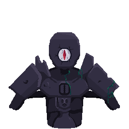
During the first two weeks of development, I had been using borders on and off, depending on the size of whatever it was I was drawing. I noticed that the more I drew, the more this difference between sprites apparent. In the end, I decided to go through all my sprites and make them have no borders. This was a slightly annoying change as I had to deal with shading more appropriately as the removal of borders had blurred the line between different parts of a sprite. It does however look better because of the changes.
Before and after: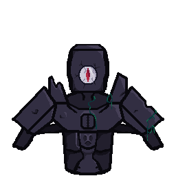
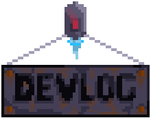
Main Menu
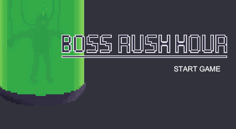
I wanted my main menu to somehow reflect the content of the main game. I ended up settling on how the player starts in a test tube and went with that idea. I drew up a higher detailed version of the test tube that is used in the main game with a few frames of animations for some bubbles and set it off-center. I drew up a simple title which I plan to revise and actually make look interesting before the final version which is also off-center on the other side of the sceen. Eventually, I added the version number down to the bottom left of the screen.
I plan to revise the whole main menu before the release as I feel like it could have just a bit more too it
Leave a comment
Log in with itch.io to leave a comment.